Tagged: websites
4 Easy Ways to Reduce Your Blog Bounce Rate
- by Alyson Shane
Whether you blog for yourself, your business, or your employer, minimizing your blog's bounce rate should be a top priority. Readers who click on your site are much more likely to come back than the ones who don't, so managing your bounce rate can go a long way towards building your audience.
If you haven't heard this term before, your blog's bounce rate is the percentage of visitors who arrive on your site, stay on one page, and then leave without clicking around.
This might not seem like a big deal - after all, if they clicked on a link you shared to get to your site, then didn't you accomplish your goal? Well... sort of.
Why is your bounce rate important?
If you run a blog simply for the sake of writing about your life or your interests, then maybe your bounce rate isn't that important to you.
But if you're anything like the millions of bloggers, artists & creatives, and businesses who feature a blog as a single section of a website designed to sell a product or service, then making sure that your site aims to encourage users to explore your site should be a top priority. You don't want them to visit your blog without looking at everything else that you have to offer, do you?
What is a "good" bounce rate?
According to this article, most websites will see bounce rates fall somewhere between 26% and 70%, so as long as you fall within that range, depending on what you do and the purpose of your website, you should be okay.
The same article cautions that a bounce rate below 20% or over 90% is usually a bad sign. The former hints at a problem with the analytics setup, the latter with the website. If you've never taken a look at your bounce rate before, you can find it in Google Analytics (which you should have installed!)
How can you reduce your bounce rate?
I'm glad you asked! It's not as difficult as it may seem, and with a few tweaks and adjustments, your blog will soon be converting like crazy.
Below are four easy ways to spruce up your blog, make it visiting better experience for your audience, and to reduce that bounce rate:

1. Improve your site's speed
Sites that load slowly are my biggest pet peeve! There's nothing worse than waiting for a website to load, or (even worse) try to navigate one which keeps refreshing because the image files take longer to load than the text (I'm looking at you, every single Huffington Post article).
If you're like me the most likely culprit is huge image files or lots of videos; I just did a speed check and managed to get my speed up by 60% by resizing just three photos. Oops. Now my website loads faster than 79% of all tested websites on pingdom.com.
Want to see how quickly your site loads? Punch your URL in here and take a look!
2. Use a clean, easy-to-navigate design
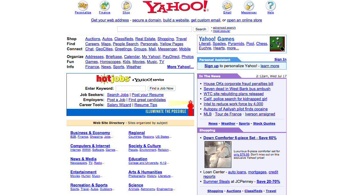
Remember when the internet looked like this?

My eyes.
Unfortunately, many websites still look a lot like this, with people trying to cram too much information onto a page at once, providing a visually unappealing and difficult to navigate and read experience for a first-time visitor.
Your website should be designed to move your readers on a journey through your site (generally called a "sales tunnel" but the same idea applies whether you're selling something or not), from the first post they read to other important areas, such as your newsletter signup page, contact form, or online store. If you're struggling to cut back on the content on your page, make a list of the most important parts of your site (e.g., your blog, your About page, your services page, etc.) and try to remove links that don't lead visitors to those areas.
Also, this should also go without saying, but you should also make sure that your site is mobile responsive (aka that it resizes to fit the width of the screen on a mobile phone). Trying to read and navigate a website which hasn't been optimized on mobile screens is a nightmare, and is one of the easiest ways to make sure that first-time visitors to your blog never come back.
3. Keep your content relevant to visitor's needs
What do you blog about? Take a look at the posts you've written recently, and then take a look at your Google Analytics. Are the search terms that are leading people to your website the same ones that you're writing about? If not, then it's time to start honing your content strategy, and then to start paying attention to how you use your headings and subheadings.
Not only does using proper headings and subheadings make your posts easy to read and understand, but it also helps boost your search engine rankings. This is because sites like Google pull information about your page based on what's in your H1, H2, H3, etc., and will help make sure that the people arriving at your site are coming there for the information that you're providing.
4. Link to related posts
One of the easiest ways to reduce your bounce rate is to offer your readers with more to do on your site once they've finished reading. Most bloggers (myself included) just add a footer to the bottom of our posts which recommend posts in the same or similar categories. Adding this at the end of a post is an easy way to entice your new visitor to explore more of what you have to say.
In addition to the footer trick, I also organize my posts into categories so my readers can quickly browse all of the posts I've written on a single topic.They can also browse posts by category and by month and year, and see a list of the most recent posts I've published on the right-hand sidebar.
Try experimenting with your layout and see how you can entice your visitors into exploring of your blog content!
That's it!
By making these changes we've not only managed to increase your blog's look, feel, and navigation, but we've also made sure that your visitors who care about your content can find you, and that your site's slow response time doesn't drive them away before they get through the first paragraph of your latest post.
Have you had issues with high bounce rates? If so, how did you solve them? I'd love to know!
7 Ways to Make a Buyer-Centric Website
- by Alyson Shane
One of the harsh realities about running a business is this: nobody cares about your products or services except you (sorry/not sorry.)
What they do care about is finding solutions to their own problems, and making sure that your website provides them with the information and tools to help them diagnose their problem, determine a solution, and take steps to solve it is a crucial part of turning them from a visitor into a customer or client.
One way that businesses approach helping their audience solve their problems is to link to landing pages based on the problems their product or service can solve. Each of these paths, starting with the landing pages, contains unique content designed to communicate your expertise in solving these problems.
By creating engaging, unique and helpful content, you can build some empathy and move your audience along the buying cycle, prompting them to fill in a contact form, call a number, or send you a request for assistance.
Below are a seven ways to make a buyer-centric website:

1. Make sure your site is current.
Making sure that the content found on the pages of your site is current and up-to-date within your area of expertise, and don't forget to update your employee roster, product lists, and anything other which might change over time. Additionally, having a website with an easy to navigate, up-to-date layout which is optimized for mobile is another integral part of their user experience, and one which will stick with them long after they've navigated away from your page.
2. Have some personality.
your website needs to be a reflection of you and your brand, which means that it needs to convey more about you than just what you offer; everything from the layout, to the tone of your copy, to the photos you choose, must contribute to an overall understanding of who you are.3. Use photos and images.
The days of walls of text are long gone, and people's attention spans are honestly just too short to sift through a page that looks like something written by Charles Dickens.
Luckily digital mediums allow you to break up you text and present it in various ways that don't contribute to your reader going cross-eyed, or worse leaving your page altogether. Some ways you can spruce up your content are:
- Custom photos & memes
- Audio feeds
- Video clips
- Cartoons
- Infographics & charts
4. Make your content interactive.
Getting people involved with your content is one of the easiest ways to keep them interested and move them through your sales cycle. Include charts and forms where applicable, and links to contact you whenever necessary5. Focus on feedback loops.
Don't make visitors hunt around your site for ways to get in touch with you. Easy to find "contact us" links are essential, and direct feedback options like "rate this" buttons, online forums, review and opportunities to post comments allow your visitors to feel more engaged with you beyond just using your services6. Include social media share buttons.
Including social media "share" buttons is a quick and effective way to encourage visitors to your site to engage with and share what you have to say. All your content (blog posts, whitepapers, videos, etc)7. Think about your visitors' learning style.
Some people prefer to read articles, some like videos, and others prefer audio. Some prefer all three! Doing a bit of research and seeing what similar sites are doing to present their information will give you valuable insight into how your visitors will want to consume the information that you have to share.
By focusing on these key elements, you can make sure that your website is buyer-friendly, leads them down the right paths, and (most importantly) is an enjoyable experience for them to use. Remember: for many people, your website is the first glimpse that they get of you as a brand, and their experience will likely dictate their relationship with you from that point onward!
Did I miss anything, or do you have something to add to this post? If so, leave a comment,shoot me an email, or tweet at me on Twitter!
