How to Go From Novice to Pro: Actionables to Make Your Blog Better
We live in a world where content is king - the more quality, share-able stuff you publish on your blog increases the likelihood that people will find you and keep coming back.
While this is all well and good, all the great content in the world can't overcome a layout that is difficult to navigate, or physically hurts to look at.
Whether you're brand-new to blogging or feel like it's time to update your blog layout to reflect the savvy, experienced blogger that you are, I've got you covered with some easy actionables to take your blog from "meh" to "yeah!"
Clean up your layout
Remember the days of the early internet, back before we really thought about things like user experience and a clean, functional layout? If you don't, check out the Wayback Machine which is a handy little archive of what websites used to look like.
By and large they all sucked.
In fact, even my old layout kinda sucked. Let's take a look:
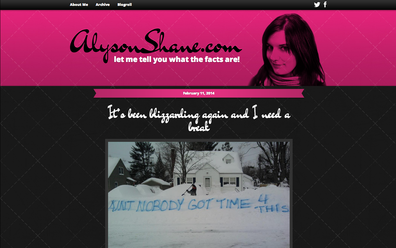
Ouch, right? Abrasive colours, no real flow, no real navigation... a very basic and (let's face it) pretty immature-looking site. Nobody visiting this website would have taken me for a professional creative-type.
This is because an abrasive, clunky-looking site demonstrates that you're not really serious about what you do; it immediately tells visitors to your blog you haven't put the time, energy and effort into making it represent you in the best way possible.
Not just that, but it shows that you aren't taking your visitor's experience into consideration, either - people won't stay on a site that's hard to read, especially a blog.
So what can you do? Here are a few steps that you can take to clean up your layout:- Stick to the basics. Darker text in a white or off-white background is easy to read and isn't painful to look at.
- Don't go font-crazy. Find a header font and a regular text font and stick to them. Google Fonts has some great free resources (thats's where both of mine, Dancing Script and Oxygen, come from)
- Rethink your layout. Visit your favourite blogs and make a list of the things that you like about them - what colours do they use? What sorts of layouts do they have?
- Need inspiration? Moodboard it out! I used Niice to create a mood board with design and style inspirations which helped guide my website re-design. You can check the one that I created here.
Get professional photos taken
Having nice, professional photos can make all the difference in how seriously people will take you and your blog. Selfies have their place, but that place shouldn't be on your sidebar or bio page!
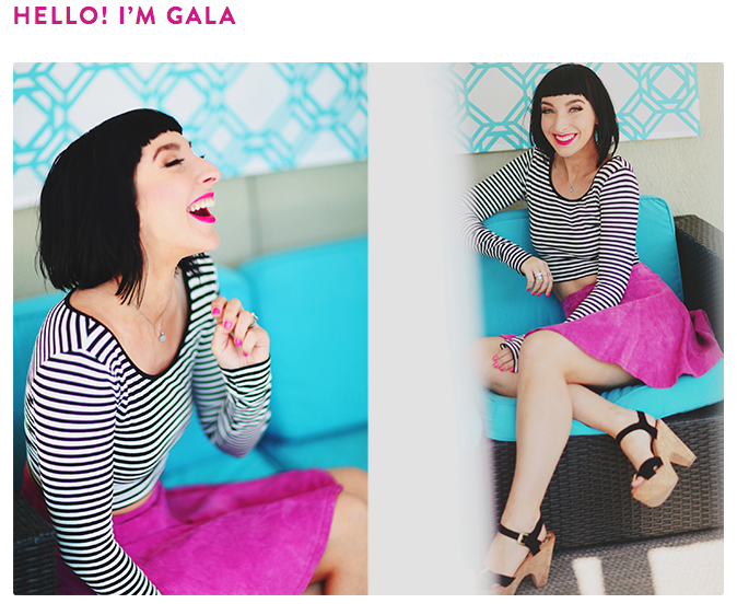 I've always loved Gala Darling's amazing photos; they really showcase her personalty and look stunning. You don't have to go high-fashion (or even pay through the nose for a professional session) though, just a decent camera and some good lighting makes all the difference!
Shop around and see what local photographers are charging for portrait sessions; it might seem like a steep investment up-front but I guarantee you that having some beautiful, professional-level photos will not only make your blog look better, but you'll feel better about sending people to check it out.
(Shameless plug: my photos are via the super-talented Palma Photography. If you're in Winnipeg or the surrounding area I highly recommend working with him.)
Review brands & experiences you love
Many big-time bloggers do "sponsored" posts where a brand sends them a product, invites them to an event, or provides them with a free experience in exchange for coverage on their blog.
If you're just starting out this might seem daunting - how do you let brands know that you're ready, willing and able to start working with them? Easy: Write up a post reviewing a product or experience that you had and show them what you can do!
I don't mean lie about being sponsored by a brand, but rather simply write a review with some nice images or graphics (preferably ones that you made yourself, you clever thing.)
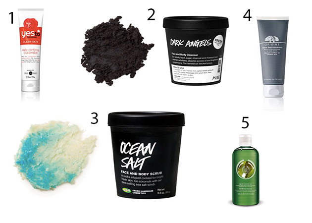
A great recent post in style that I recommend checking out is Sarah from Sunshine & Mint, who recently blogged about her natural skincare routine, and reviewed the products that she uses on a regular basis. It's that easy!
Additionally, make sure to link to any brands you mention in your post, and in any posts you create on social media! This means linking to their Facebook page in your Facebook post, @mentioning them on Twitter, etc. This dramatically increases the likelihood that the right people will not only see your post, but will want to work with you in the future. At the very least, an astute social media manager will share your post with that brand's audience, which will bring more people to your blog.
Include links to recent posts/projects
Whether someone is visiting your blog for the first time or is a longtime reader, making sure that they can easily find links to your other work is a great way to show off your content and increase engagement.
If you're a blogger with lots of projects, helpful content, or multiple-post series, consider creating a 'projects' page like I have, or link to the in your sidebar to help people find them (Ashley of A Silver Twig does a great job of this on her sidebar, in case you're looking for examples)
Other helpful stuff your blog should include is:
- Recent Posts section with links to your most recent content
- Older Posts or Archives section or list. I keep mine on my sidebar and it's organized by month, but lots of other bloggers like Tony Pierce put theirs at the bottom of their page.
- Projects or similarly-named page for longer, more in-depth projects. This serves as a place where readers can easily find and navigate around related posts.
- Footers linking to other related work, eg: "this post is part of a series, click here to see more!"
Make your social media links easy to find
Prominently displayed social media links encourage readers to interact with you across multiple social platforms - if they like your blog they're likely to start following you on Twitter, connecting with you on Pinterest, or wherever you may be.
Additionally, showcasing the multitude of ways that you're connected online also demonstrates how social media-savvy you are. Just make sure that you're linking to active profiles! Nobody wants to engage with a dead and forgotten profile.
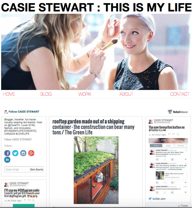
Bonus: If your site layout allows for it, RebelMouse is a great widget which will pull all of your content from a social media feed (mine pulls my Twitter & Tumblr) and show it on a single page. I snagged this idea from blogger superstar Casie Stewart, who uses it as the landing page on her personal website, and I love how it looks.
Include a copyright in your footer
Even though you have a built-in copyright on original material that you publish online, a little copyright at the bottom of your page is a handy reminder that the content on your site is yours, and helps add a more professional feel to your content.
Include calls to action
An easy way to help people find your other posts, subscribe to your newsletter, or interact with your post is to include calls to action throughout your blog.
For example, there's a call to action at the bottom of my posts which looks like this:
I've written about the importance of newsletters in a previous post, but let me just say this: newsletters are one of the most powerful tools that you have to communicate with your audience.
This is because when people sign up for your newsletter they are saying "yes, I confirm that I want to hear from you on a regular basis!" and are granting you permission to send your content directly to their inbox. No worrying about social media algorithms, sites getting shut down, etc. You always have a way to communicate directly with your audience.
You can also include calls to action in the body of your posts by ending a post with a question, or series of questions meant to engage your reader and encourage comments. By asking questions or actively asking for suggestions, you show your readers that you want to interact with them and increase the likelihood that they'll comment, share or subscribe.
Share what you know (be a thought leader)
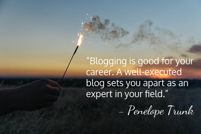
I love that quote from powerhouse (and one of my personal heroes) Penelope Trunk.
Blogging is about having something to say, and saying it well.
Don't just share what you know, share why you feel it's important knowledge. Be descriptive, be creative, and be daring. Think about the things that matter to you as a person, as a business owner, as a creative, whatever, and get writing about it.
Have you been building your business from the ground up? Blog about that. Do you have keen insight into B2B marketing? Blog about that. Have you built a mini internet empire painting watercolours of sloths? Blog about that!
Put yourself out there and show your audience who you really are - that's what will keep them coming back, after all.
Do you have any additional tips for making your blog better? Any horror stories of blog layouts past? I'd love to hear them!
